the project
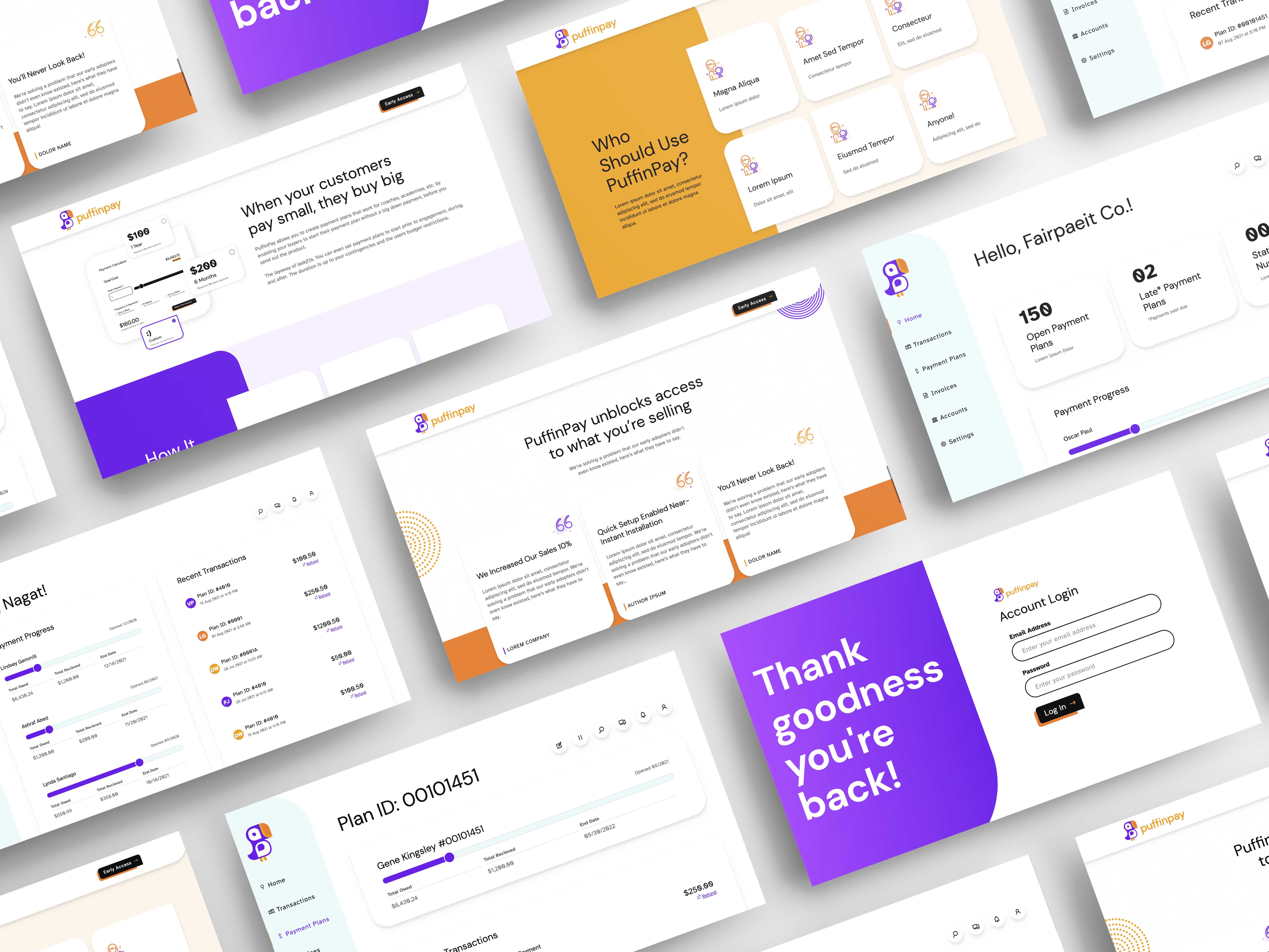
Through consultant freelance work, I was enlisted to create a new brand for a new product. Talk about the best thing a client could ask for, right?! With nothing but a half-decided name, and a whole lot of creative exploration, the Puffin Pay brand came to fruition and was executed across a variety of digital mediums.
process
First, the brand. What is it? What does it stand for? Who is the target audience and how do we cater to them? Crafting a brand personality took a lot of research and discovery with the client to end up with a vision that would make something everyone loathes, a much more friendly and intuitive experience.
At a high level, here is what was executed:
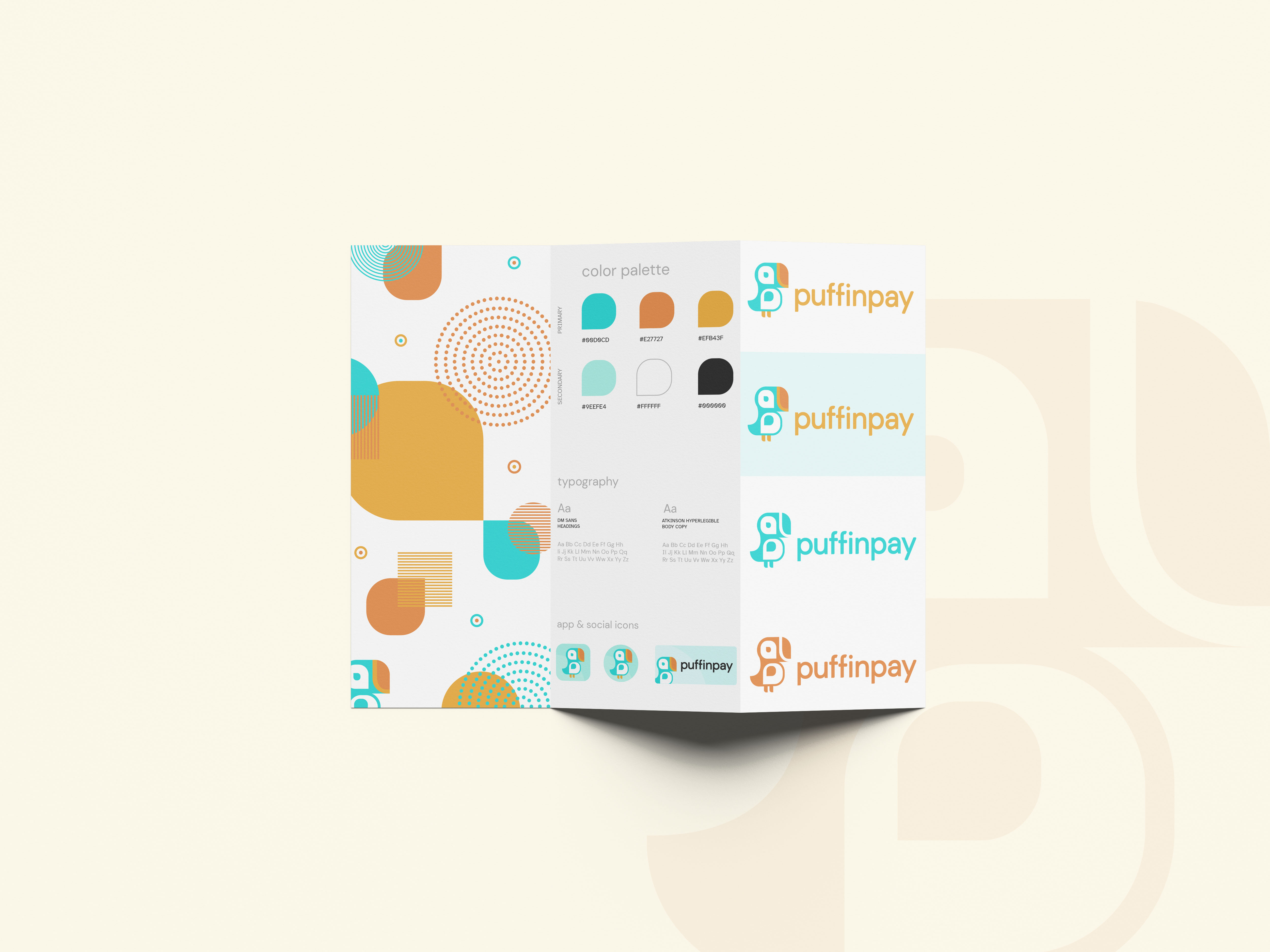
- Logo Design
- Color Palette
- Typography
- Pattern Design
- Custom Icon Design
- Creative Copywriting
- Email Template Design
- UX Architecture & Wires
- App Design
- Desktop Dashboard Design
defining a brand
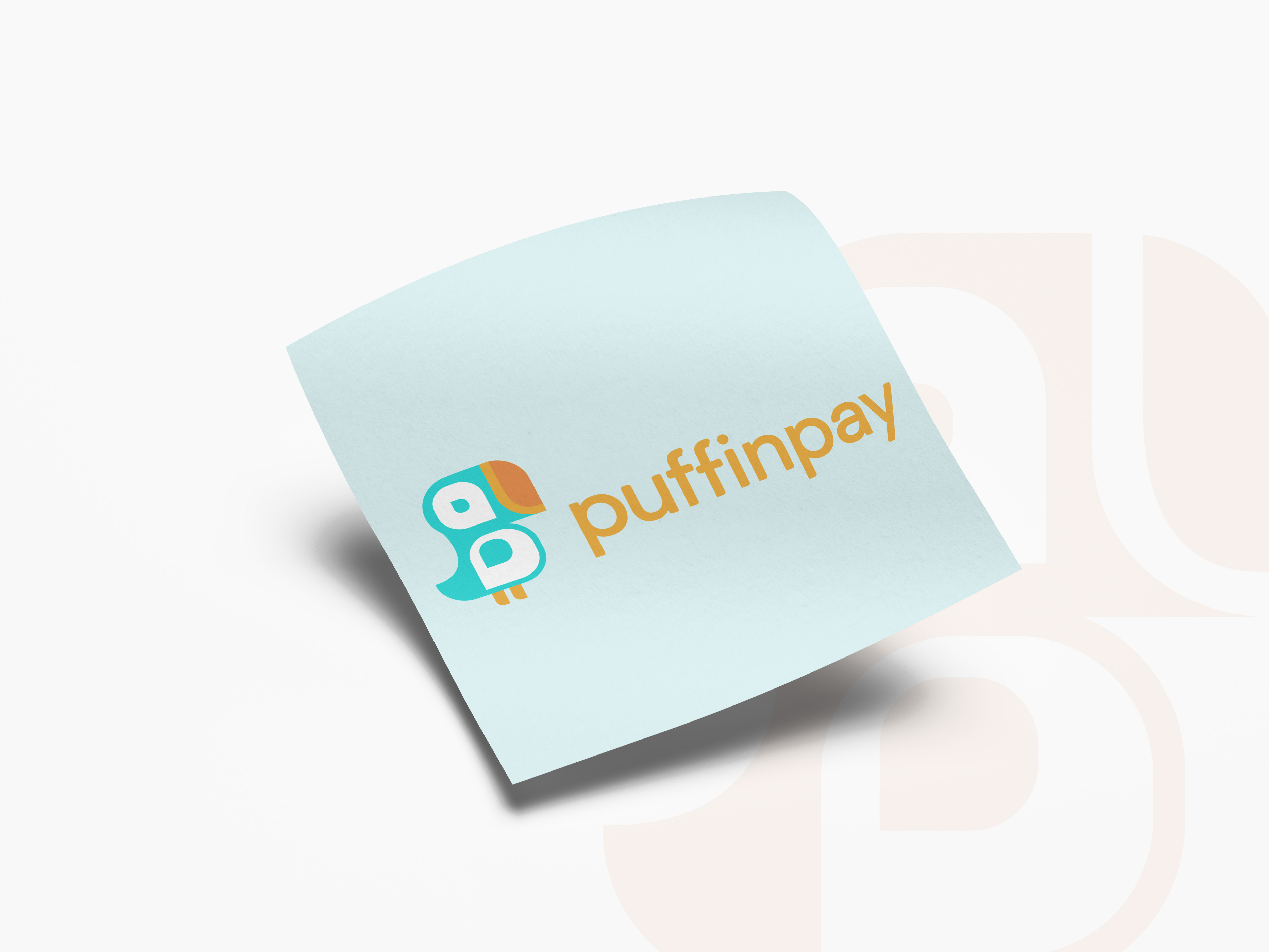
After many interviews and conversations with product owners, the first step to nailing down the brand was deciding upon the name. We started with Tender Pay, iterated to Pay Fair, and through the evolution of character development integrating into the brand persona, we landed on Puffin Pay.
You can see the variety of explorations that lead to this development, and ultimately the final logo design we landed on could not be any more inviting! It has so much character and makes the experience of managing and tracking outgoing money that much less annoying.
architecting an experience through collaboration
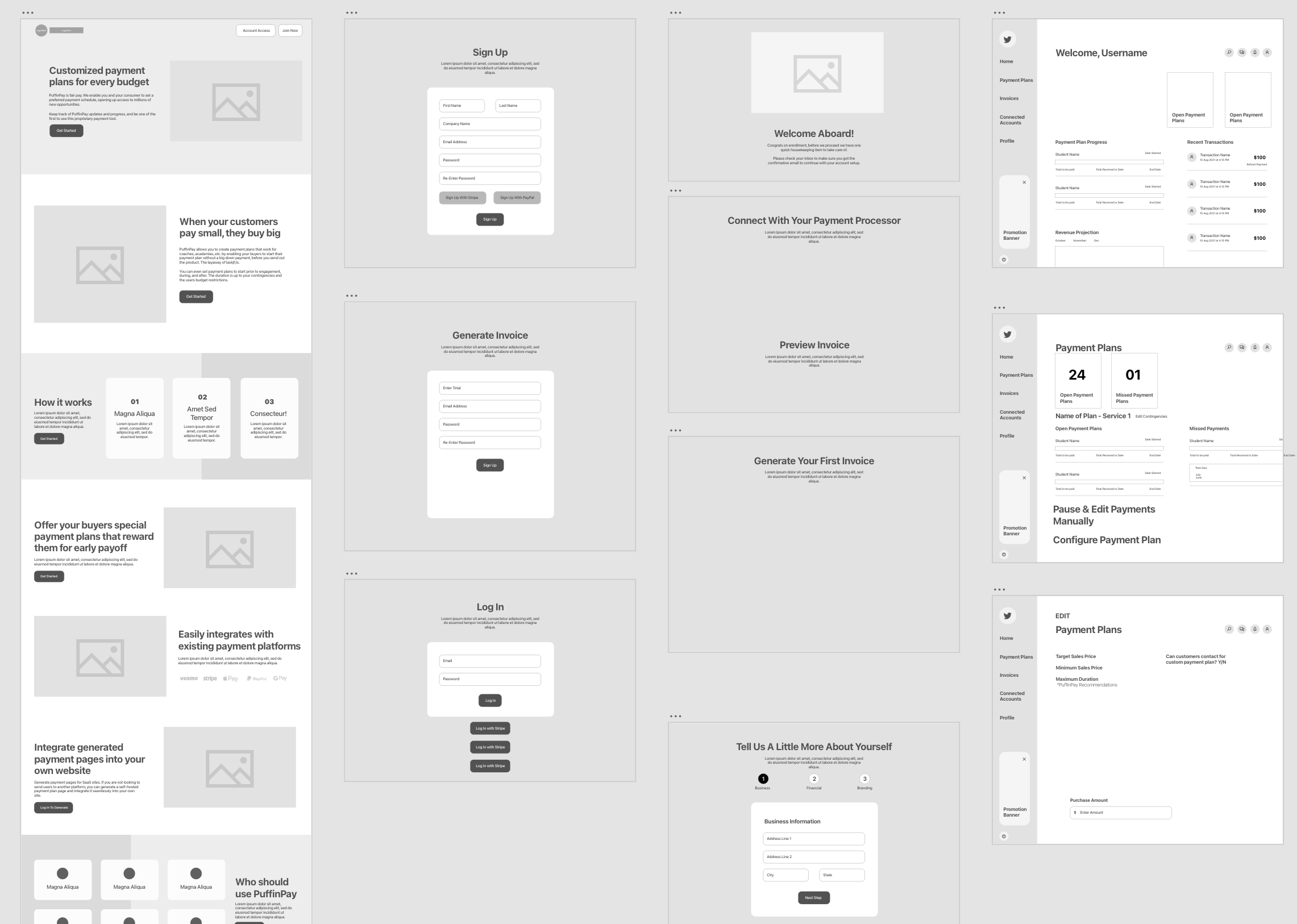
As with any new product, when you begin brainstorming templates and layouts, the snowball effect of uncovering needs, and balancing that with nice-to-haves began to unfold. The wireframe development was critical to a seamless execution in-medium, as it allowed us to work through many different user-scenarios and start to organize a component library for the application.
moving to in-medium design
After the wireframes were started, we began working on the designs. This was happening in a more agile approach, so as some wireframes were approved, we opted to create designs for pages to get a "coming soon" and "marketing landing page" layout up and running. This created some unique scenarios for designing pattern libraries, and establishing the style for the landing page versus the dashboard application were two very different methodologies.
Of course, with the goal of keeping a consistent brand personality shining bright, I also took to copywriting a lot of the content you see in the wireframes, to once again drive home that brand personality with messaging that pulls you in, in a friendly manner.
beyond the dashboard
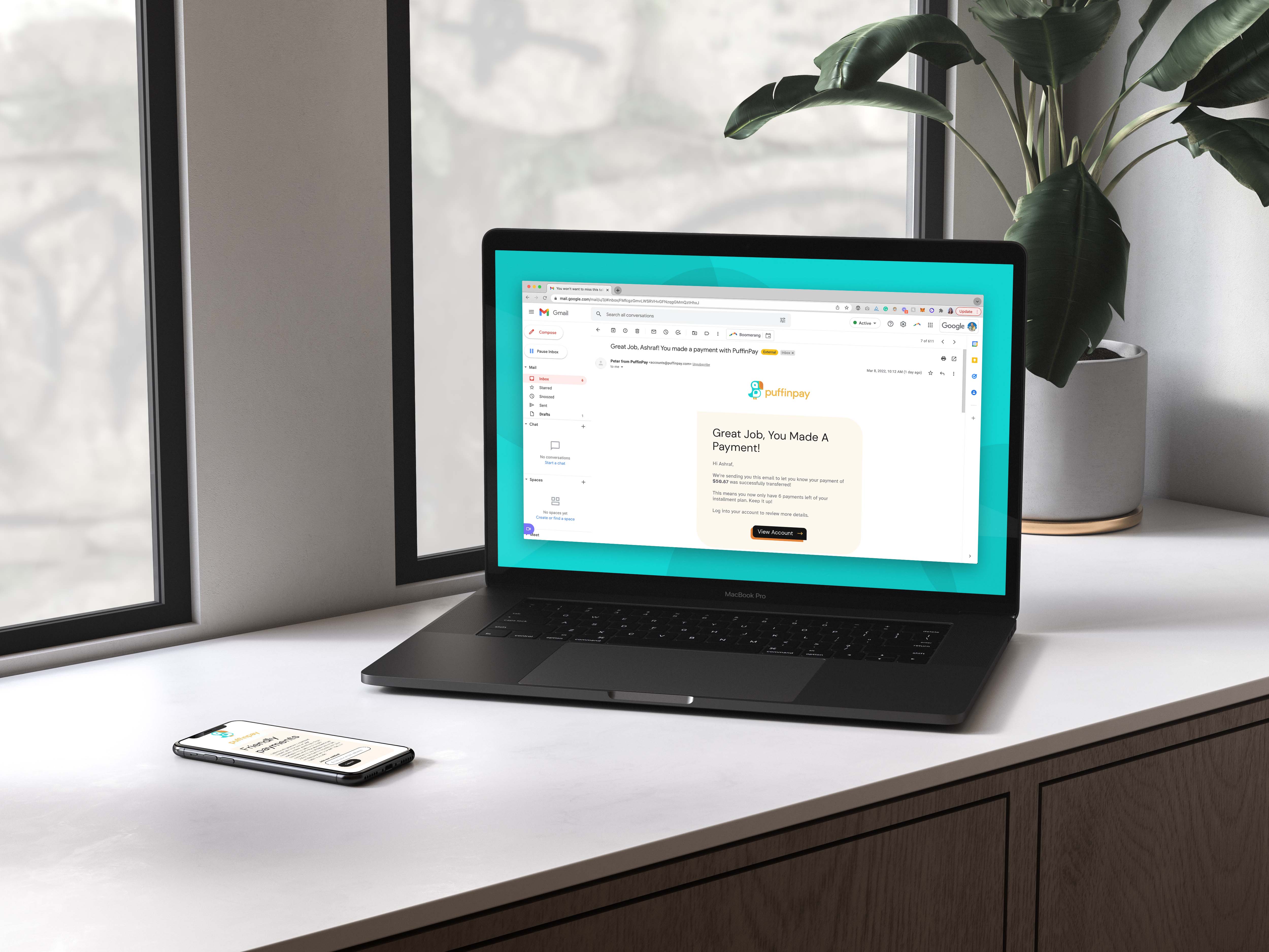
As I continued working on the buildout of the dashboard and application experiences, there was also a need for other digital applications of the brand, such as the email communications.
The current website is live and allows users to sign up for email notices and updates while the platform is being built out, and there is testing and piloting happening now with Puffin Pay that highlighted the need to streamline those communication methodologies.
As testing is happening and ongoing, new templates, components, and even pieces outside of the primary application, are uncovered and have been providing the opportunity to execute a brand new persona in all areas of the internet.